The short answer
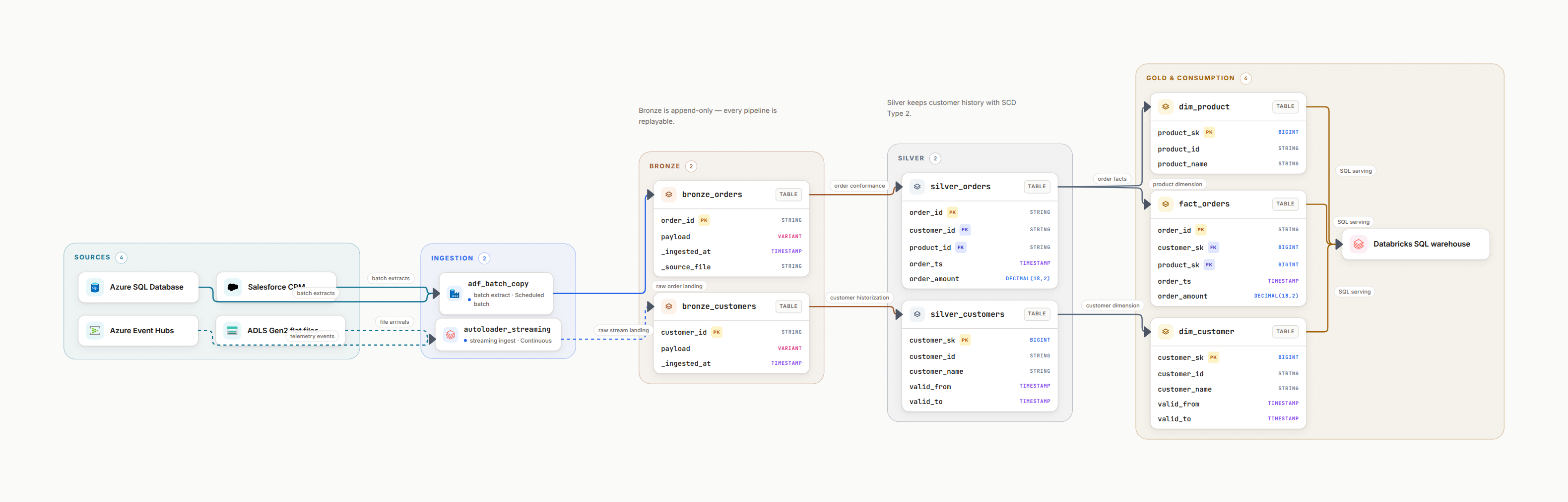
An Azure data platform architecture diagram reads left to right in five layers: sources (on-premises databases, SaaS APIs, IoT devices), ingestion (Azure Data Factory for batch, Event Hubs or IoT Hub for streams), storage (ADLS Gen2 containers, usually bronze, silver and gold), processing (Azure Databricks or Synapse Spark pools), and serving (a Synapse SQL pool or Azure SQL, then Power BI). On top of that flow, draw three boundaries: the subscription and resource group each resource lives in, the VNet and private endpoints around storage and compute, and the identity that carries each hop (a managed identity, Microsoft Entra ID, Key Vault). Two details separate a diagram people use from a diagram people ignore: which integration runtime each Data Factory activity runs on, and where the Databricks compute plane sits relative to your own VNet. Everything below is how to draw those.
1. What Goes in an Azure Data Platform Architecture Diagram
Azure has 200+ services and your data platform probably uses a dozen of them. Not every one deserves a spot in the diagram. Follow the flow: ingestion → storage → processing → serving → consumption. These are the services that earn a node.
Ingestion Layer
How data enters your platform
- • Azure Data Factory: Batch ETL/ELT pipelines
- • Azure Event Hubs: Real-time streaming ingestion
- • Azure IoT Hub: IoT device data ingestion
- • Logic Apps: Low-code integrations
Storage Layer
Where data lives
- • ADLS Gen2: Data lake for analytics
- • Azure Blob Storage: Unstructured data
- • Azure SQL Database: Operational data store
- • Cosmos DB: NoSQL for global apps
Processing Layer
Where data is transformed
- • Azure Databricks: Spark-based processing
- • Azure Synapse Analytics: Data warehouse + lakehouse
- • Azure Stream Analytics: Real-time processing
- • HDInsight: Hadoop ecosystem
Serving & Consumption
How data is consumed
- • Power BI: Business intelligence
- • Azure API Management: Data APIs
- • Azure Analysis Services: OLAP cubes
- • Custom Apps: Web/mobile apps
Governance and identity, under the current names
Two of these were renamed and half the diagrams in circulation still use the old labels, which makes them look older than they are.
Microsoft Purview
Data discovery, cataloging and lineage. Formerly Azure Purview.
Azure Key Vault
Secrets, keys and certificate management
Microsoft Entra ID
Identity and access management. Formerly Azure Active Directory.
Pro Tip
Show What Matters to Your Audience
Executive diagram? Focus on data sources, processing and consumption, skip the VNets. Security review? Highlight Key Vault, managed identities and private endpoints. One platform, multiple diagram views.
2. How to Draw an ADF (Azure Data Factory) Architecture Diagram
Azure Data Factory has four object types, and only two of them are boxes. Pipelines are the boxes. Linked services are the edges. Datasets and triggers are labels on those edges. Draw a factory any other way and you end up with a picture of the ADF authoring canvas rather than an architecture.
The part almost every ADF diagram omits: the integration runtime
Every activity in a factory runs on an integration runtime, and which one it is decides the network path, the region the data passes through, and who patches the machine. If the runtime is not on the diagram, the first question in the security review has no answer on the page.
Azure integration runtime
Microsoft-managed compute, bound to a region (or set to auto-resolve, which means the region is chosen at run time and your data residency answer becomes "it depends"). Draw it inside the Azure boundary, and write the region on it.
Self-hosted integration runtime
A Windows service you install on a VM or an on-premises machine. It makes the outbound connection to Azure, so the arrow points from your network out. Draw the node inside the on-premises or VNet box, never inside the Data Factory box. This is what stops the network team asking which inbound firewall port to open, because there is none.
Azure-SSIS integration runtime
A managed cluster that runs SSIS packages lifted from an on-premises SQL Server. It joins a VNet if the packages need to reach private sources, so it belongs inside the VNet region on the diagram, with the SSISDB catalog it depends on drawn next to it.
Managed VNet and managed private endpoints
When the factory runs in a managed virtual network, Azure creates private endpoints from that network into your storage and SQL. Draw the managed VNet as its own region: it is Microsoft-managed and it is not your VNet, and conflating the two produces a diagram the network team will reject.
Label the trigger, not just the arrow
A pipeline starts for one of four reasons, and they behave very differently when something goes wrong. Put the reason on the incoming edge:
Trigger types worth naming
- • Schedule: fires on a clock, no backfill of missed windows
- • Tumbling window: fixed slices, replayable, supports dependencies
- • Storage event: fires on blob created or deleted
- • Custom event: fires from an Event Grid topic
Scope: draw patterns, not pipelines
A production factory often holds 150 to 250 pipelines built from about six patterns: full table copy, incremental watermark copy, file landing, API pagination, SSIS lift, and a control pipeline that orchestrates the rest. Draw the six patterns once each and list which sources use them. A diagram with 200 boxes is a database, not a diagram.
From experience
The most useful annotation I have ever added to an ADF diagram was a single line next to a mapping data flow: "Spark cluster start, allow 4 to 6 minutes unless the IR time-to-live is set". Mapping data flows do not run on the factory, they run on a Spark cluster Azure starts for the activity. Three separate people had opened incidents about a transform that "hangs for five minutes" before that note existed.
3. Azure Data Flow Diagram: Two Different Drawings
"Azure data flow diagram" means one of two things, and asking which one saves an hour of drawing the wrong artefact.
1. A data flow diagram of the platform
Which service moves which dataset where, in what format, on what schedule. One labelled arrow per hop, sources on the left, Power BI on the right. This is the architecture artefact, and it is what the rest of this section covers.
2. A mapping data flow in ADF
A specific Data Factory feature: a visual transform graph of source, join, derived column, aggregate, sink, which compiles to Spark and runs on a cluster Azure starts for the activity. That is pipeline-level detail. It belongs in the pipeline documentation, not in the platform diagram.
Arrow styles and labels that carry information
Arrow Styles by Type
What to Label on Arrows
- • Frequency: Real-time, hourly, daily, on-demand
- • Format: Parquet, Delta, JSON, CSV, Avro
- • Volume: ~100GB/day, ~1M events/min
- • Protocol: HTTPS, SFTP, REST API, ODBC
Example: Labeling a Complete Pipeline
┌────────────────┐     Daily batch        ┌─────────────────┐     Hourly         ┌──────────────┐
│   Salesforce   │────(CSV, 2GB/day)────>│  Azure Data     │───(Parquet)───>│  ADLS Gen2   │
│   (CRM data)   │    via HTTPS          │    Factory      │                 │  /raw/sales/ │
└────────────────┘                        └─────────────────┘                 └──────────────┘
                                                                                       │
                                                                                       │ Spark job
                                                                                       │ (nightly)
                                                                                       ▼
┌────────────────┐                        ┌─────────────────┐                 ┌──────────────┐
│    Power BI    │<────────────────────── │ Synapse SQL Pool│<────────────────│  ADLS Gen2   │
│  (Sales Dashboard)                      │  (dim_customer) │   Delta format  │ /curated/    │
└────────────────┘     Direct Query       └─────────────────┘                 └──────────────┘
Handling Complex Flows
Multiple pipelines
Use color-coding to differentiate parallel flows. Blue for customer data, green for product data, orange for transaction data.
Fan-out patterns
One source feeding multiple destinations? Show each arrow clearly labeled with purpose: "to analytics", "to ML training", "to archive".
Error paths
Show where failed records go. Use red dashed lines to quarantine or error containers. This matters for debugging, and on Azure it is usually a separate ADLS Gen2 path nobody documents.
Dependencies
If Pipeline B waits for Pipeline A, show it with dotted arrows or numbering (1, 2, 3) to indicate sequence. Tumbling window triggers make this explicit in ADF, so mirror it on the diagram.
4. Azure Synapse Analytics Architecture Diagram
A Synapse workspace is a container, not a compute engine. Drawing it as one box is the most common mistake in Azure warehouse diagrams, because the three things inside it bill differently, scale differently and fail differently. Give each one a node.
| Inside the workspace | What it does | What to write on the node |
|---|---|---|
| Dedicated SQL pool | Provisioned MPP warehouse, the former SQL Data Warehouse | DWU level and pause schedule |
| Serverless SQL pool | Queries files in the lake with T-SQL, no cluster to manage | Which containers it reads, billed per data scanned |
| Apache Spark pool | Notebook and job compute inside the workspace | Node size, autoscale range, idle shutdown |
| Synapse pipelines | The same engine as Azure Data Factory, hosted in the workspace | Say it is Synapse pipelines, not a separate factory |
The workspace always has a primary storage account
Every Synapse workspace is created against an ADLS Gen2 account and a container it treats as its default filesystem. It exists whether or not anyone uses it, and it is where Spark writes by default. Draw it, or someone will spend an afternoon working out which storage account holds the notebook output.
A dedicated pool always spreads data across 60 distributions
The number does not change with the DWU level, only the amount of compute mapped onto it does. That makes the distribution strategy on your largest fact table (hash, round robin, or replicated) the single decision that most affects query shuffle, so put it on the node next to the table name.
Managed VNet and data exfiltration protection are workspace-level
Both are chosen at workspace creation and cannot be flipped later. If the workspace uses a managed VNet, draw it as a region around the pools, with managed private endpoints out to storage. If exfiltration protection is on, every outbound target has to be an approved private endpoint, which is worth a note on the boundary itself.
If the team has moved to Microsoft Fabric, the nodes change
Fabric covers similar ground with different objects: OneLake instead of a storage account you name, Lakehouse and Warehouse items instead of pools, and Fabric Data Factory pipelines. The boundary to draw is the capacity the workspace is assigned to, not a VNet. Do not mix Synapse and Fabric names in one diagram, it reads as a platform nobody has decided about.
5. Azure Databricks Architecture Diagram: Draw the Plane Split First
Azure Databricks is two things in two different subscriptions, and a diagram that puts them in one box cannot answer a single network question.
Control plane
The workspace UI, the job scheduler, notebook metadata and the cluster manager. It runs in a Microsoft-managed subscription that you do not see in your portal. Draw it as a separate region labelled as managed by Azure Databricks.
Compute plane
The cluster VMs that actually read your data. They run in your subscription, either in a VNet Databricks creates or in one you inject. This is the region your storage private endpoints have to reach, and the one your firewall rules apply to.
Tables are Delta files in ADLS Gen2, not objects inside Databricks
Draw the arrow from the compute plane to the storage container, and put the table names next to the container rather than inside the Databricks box. It is the difference between a diagram that answers "what survives if the workspace is deleted" and one that does not.
Unity Catalog is regional
There is one metastore per region, and workspaces in that region attach to it. On a multi-region diagram, that means a metastore node per region and an honest arrow showing that a workspace in another region does not share it. Catalogs, schemas and tables hang off the metastore.
The Access Connector is the identity, not a service
Unity Catalog storage credentials use an Access Connector for Azure Databricks, a managed identity resource in your subscription, and external locations point it at ADLS Gen2 containers. Show it as a label on the storage edge unless the diagram is specifically about identity, in which case it earns a node.
Say which SQL compute serves BI
A Databricks SQL warehouse and a Synapse dedicated pool both end up feeding Power BI, and plenty of Azure platforms run both. Two arrows into Power BI with no labels is where the "why do these two dashboards disagree" thread starts.
The full version of this drawing, including private endpoints and the secure cluster connectivity path, is in the Azure Databricks architecture diagram guide. For the lakehouse layers that sit on top of it, see the medallion architecture guide.
6. Azure Data Lake and Data Warehouse Layout on the Diagram
ADLS Gen2 is Blob storage with the hierarchical namespace turned on, which is why the top-level object is a container rather than a bucket, why a folder rename is a real metadata operation instead of a copy, and why POSIX-style ACLs exist alongside Azure RBAC. All three of those show up on the diagram.
Layout A: one container per layer
bronze, silver and gold are three containers in the same storage account.
- • Coarse RBAC boundary per layer, easy to explain in a review
- • Different lifecycle policies per container
- • More storage-level roles to keep in sync
Layout B: one container, folders per layer
A single container with /bronze, /silver, /gold underneath.
- • Simpler mount and external location configuration
- • Access control moves to directory ACLs, which are harder to audit
- • One lifecycle policy has to cover every layer
Write real paths on the storage nodes
A node labelled "Raw" is decoration. A node labelled abfss://[email protected]/salesforce/accounts/ is documentation, and it is the exact string someone will need at 2am. Add the partition scheme underneath it if there is one, such as ingest_date=YYYY-MM-DD.
Draw the archive edge
Lifecycle management rules that move blobs to cool or archive tiers are invisible until someone tries to read a two-year-old file and waits hours for a rehydration. One dotted arrow to an archive node, labelled with the age threshold, prevents that.
Name the warehouse serving layer explicitly
Synapse dedicated pool, Azure SQL Database, Databricks SQL warehouse, or Fabric Warehouse: these are four different answers to "where does the gold layer get queried from", and Azure platforms often have two of them at once.
Show the Power BI mode
Import, DirectQuery and Direct Lake put completely different loads on the layer behind them. The word belongs on the arrow into Power BI.
If the lake and the warehouse are converging into one layer for you, the data lakehouse architecture guide covers how to draw that without ending up with two overlapping storage stories on one page.
7. Four Azure Data Platform Reference Architectures
Microsoft publishes reference architectures in the Azure Architecture Center, and nearly every real platform is a variant of one of these four. Recognizing yours tells you how to structure the diagram. Each one can also be generated as a starting point with the Azure data platform diagram generator, then adjusted to your actual resources.
Pattern 1: Modern Data Warehouse
Batch-oriented, structured data from enterprise systems, cleaned and modeled in Synapse, served to Power BI.
Flow:
On-Prem DBs → Azure Data Factory → ADLS Gen2 (raw) → Synapse SQL Pools (curated) → Power BI
Best for: Traditional BI use cases, financial reporting, operational dashboards
Pattern 2: Real-Time Analytics
Streaming data from IoT devices or applications, processed in real time, served to live dashboards and alerts.
Flow:
IoT Hub / Event Hubs → Stream Analytics → Synapse / Cosmos DB → Real-Time Power BI / APIs
Best for: IoT monitoring, fraud detection, real-time customer analytics
Pattern 3: Data Lakehouse (Medallion Architecture)
Raw, then bronze, silver and gold layers in ADLS Gen2, processed by Databricks using Delta Lake.
Flow:
Multiple Sources → ADF → ADLS (Bronze) → Databricks → ADLS (Silver/Gold) → Power BI / ML
Best for: ML workloads, advanced analytics, unifying batch and streaming
Pattern 4: Hybrid & Multi-Cloud
Data spans on-premises, Azure and other clouds. Integration runs through a self-hosted integration runtime and Azure Arc.
Flow:
On-Prem + AWS S3 → ADF (self-hosted IR) → ADLS Gen2 → Synapse → Power BI
Best for: Enterprises migrating to cloud, multi-cloud strategies
| Pattern | Key Azure Services | Diagram Focus |
|---|---|---|
| Modern DW | ADF, Synapse, ADLS Gen2 | Batch pipelines, SCD handling |
| Real-Time | Event Hubs, Stream Analytics | Streaming paths, latency |
| Lakehouse | Databricks, Delta Lake, ADLS | Bronze/Silver/Gold layers |
| Hybrid | ADF self-hosted IR, Arc, VPN | On-prem connections, security |
8. Subscriptions, Resource Groups and VNets: the Boundaries to Draw
Azure resources are not floating in a cloud, they sit in a hierarchy, and the hierarchy is where most of the operational answers live. Draw it as nested regions rather than as text in a corner.
Subscription as the outermost container
Quotas, policy assignments and the billing boundary all attach to the subscription. Most enterprises run one per environment, which means a single diagram labelled "dev / test / prod" is misleading the moment the networking differs. Draw one per subscription when the VNets or private endpoints are not identical.
Resource groups as inner regions
A resource group is the deletion and lifecycle boundary. Grouping the diagram by resource group instead of by data flow is a common instinct and it produces an unreadable picture, so keep the flow left to right and draw the groups as a translucent layer behind it.
VNet, subnets and private endpoints
Once a storage account has a private endpoint and public access disabled, everything outside the VNet needs a route in, including the Power BI on-premises data gateway. Draw the gateway. It is the resource people forget until a report breaks after a network hardening sprint.
Identity on every hop
System-assigned managed identity, user-assigned managed identity, service principal, or a key out of Key Vault. Writing which one is on each arrow turns the diagram into the artefact an access review actually uses, instead of a picture the reviewer ignores while reading the IAM export.
Region, and what crosses it
Put the Azure region on the boundary, then mark any arrow that leaves it. Cross-region traffic has a cost and a latency story, and it is the first thing a data residency question turns on.
If your organisation follows the Cloud Adoption Framework, these boundaries are already decided for you by the platform team, and the Azure landing zone diagram guide covers how to draw the management group and hub-and-spoke layers your data platform lands inside.
9. Visual Design Rules That Make Azure Diagrams Readable
A diagram's job is to communicate quickly. These rules make an Azure architecture instantly readable. If you need the icon set itself, the Azure icons library has the full downloadable set, including Data Factory, Synapse and Databricks.
Use official Azure icons
Microsoft publishes the icon set. Consistent icons mean instant recognition. No one should have to guess whether that blue box is a SQL database or a storage account.
Left-to-right data flow
Sources on the left, consumption on the right. Matches how we read and creates a natural narrative flow.
Group by layer or function
Use containers or swim lanes to group related services: ingestion layer, processing layer, serving layer. Visual hierarchy is what lets someone skip to the part they need.
Color-code by purpose
Blue for data sources, green for processing, orange for consumption. Or by domain: finance, marketing, operations. Pick one meaning for color and hold it.
Label connections clearly
Do not just draw arrows. Add labels: "Daily batch (Parquet)", "Real-time (JSON)", "API (REST)". Format and frequency matter.
Show security boundaries
Indicate VNets, private endpoints and managed identities. Auditors and security teams need to see isolation at a glance.
✓ Good Example
- • Azure Data Factory icon labeled "ADF: Customer Pipeline (self-hosted IR)"
- • Arrow labeled "Hourly batch (Parquet, ~50GB)"
- • ADLS Gen2 container "abfss://bronze@stprodlake/customers/"
- • Color-coded by data domain (blue = customers)
- • VNet boundary clearly marked, private endpoint shown
✗ Bad Example
- • Generic rectangles, no Azure icons
- • Unlabeled arrows pointing everywhere
- • Vague labels like "Database 1" and "Storage"
- • One box labeled "Synapse" hiding three compute types
- • No security, network or integration runtime context
Pro Tip
The 5-Second Rule
Someone should be able to look at your diagram for 5 seconds and answer: "Where does data come from?" and "Where does it go?" If they cannot, simplify or add clarity to your visual hierarchy.
10. Tools for Creating Azure Diagrams
| Tool | Best For | Azure Icons | Collaboration | Cost model |
|---|---|---|---|---|
| Microsoft Visio | Enterprise standard | ✓ Native stencils | SharePoint | Per-user subscription |
| Lucidchart | Cloud collaboration | ✓ Library | Real-time | Free tier, per-user paid plans |
| draw.io (diagrams.net) | Free, open source | ✓ Azure shape library | File-based | Free |
| Datadef | AI generation, repo sync | ✓ Built-in | Cloud, Git, live embeds | 1 AI diagram a day free; Pro $12/month, 7-day trial |
| Miro | Whiteboarding, workshops | Manual import | Excellent | Free tier, per-user paid plans |
| Azure Architecture Center | Reference architectures | ✓ Editable templates | N/A (templates) | Free |
Choose Visio if:
- • You are in a Microsoft-heavy enterprise
- • You need offline editing capability
- • You have existing Visio templates and stencils
- • SharePoint integration is important
Choose Lucidchart if:
- • You need real-time collaboration
- • Your team is distributed
- • You want cloud-native with version history
- • You integrate with Confluence or Jira
Choose draw.io if:
- • The budget is zero
- • You want to store diagrams in Git
- • You prefer open-source tools
- • Simple needs, no automation required
Choose Datadef if:
- • You want the diagram generated from a description
- • The Azure estate is defined in Terraform in a repo
- • The diagram has to stay embedded and current in a wiki
- • An AI agent should be able to draw and edit it
From experience
Tool choice matters less than consistency. Pick one tool and use it for every platform diagram. Mixing Visio, Lucidchart and PowerPoint across teams creates a documentation mess that nobody can search.
11. Common Mistakes, and Why an Azure Diagram Is Worth the Upkeep
Azure's complexity problem
A typical enterprise Azure data platform spans 15 to 20 services: Data Factory, Synapse, Databricks, ADLS Gen2, Event Hubs, Purview, Key Vault, and more. Without documentation, only two or three people understand the full picture, and they become the bottleneck for every change.
Faster onboarding
New hires understand the platform in hours rather than weeks. They see how data reaches Power BI without asking twenty questions.
Faster incident response
When a Synapse pool is paused or a cluster fails, you see immediately what is affected downstream, without reconstructing dependencies from memory.
Security and compliance
Auditors want to see data flow. A diagram showing encryption, private endpoints and access paths closes a review faster than fifty pages of text.
Eight mistakes that make an Azure diagram useless
Too much detail in one view
Do not put every resource group, subnet and NSG rule in one diagram. Create layered views: high-level architecture, detailed network diagram, security diagram.
No ownership or dates
Every diagram should carry an owner, a last-updated date, and a link to more detail. Stale diagrams are worse than none, because they mislead.
No version control
Architecture changes. Keep old versions. Git-based tools, or tools with built-in versioning, save you from "wait, when did we add that?"
Generic labels
"Storage Account 1" tells nobody anything. Use the real name and path: "ADLS Gen2, stprodlake, container bronze" so people know what it is and where to find it.
Ignoring the audience
Do not use the same diagram for executives and engineers. Executives want sources and insights. Engineers need SKUs, regions and runtimes.
No data flow direction
Arrows without direction are pointless. Always use directional arrows. Bidirectional arrows should be rare, and clearly labeled when used.
Forgetting security
If you do not show VNets, private endpoints and managed identities, the security team will ask a hundred questions. Show them from the start.
One Synapse box, one Databricks box
Both hide the distinction that matters: three compute types in a Synapse workspace, two planes in two subscriptions for Databricks. Splitting them is the cheapest accuracy win on the whole page.
The biggest mistake: not updating
The main reason diagrams become useless is that nobody updates them. Make diagram updates part of your definition of done. Pipeline changed? Update the diagram. New service added? Update the diagram. Treat it like code documentation, not as optional.
From experience
I have joined teams where the only person who understood the full Azure architecture had left six months earlier. Rebuilding that picture from portal blades, ADF pipeline JSON and Databricks job configs took three weeks. One maintained diagram would have saved all of it.
If your Azure estate is defined in Terraform, the upkeep can stop being manual. Datadef connects read-only to a GitHub, GitLab or Azure DevOps repository, parses each .tf file directly (no terraform init, no state file, no cloud credentials), draws modules as regions and keeps per-environment resource counts, then redraws the diagram and an architecture.md every day. A commit that changes nothing structural leaves the diagram alone, and nodes you moved by hand keep their position. The Azure Terraform diagram generator guide covers what the azurerm provider resources map to.
12. Frequently Asked Questions
What is an Azure data platform architecture diagram?
It is a diagram showing how data moves through Azure, from left to right, in five layers: sources (on-premises databases, SaaS APIs, IoT devices), ingestion (Azure Data Factory, Event Hubs, IoT Hub), storage (ADLS Gen2 containers, usually bronze, silver and gold), processing (Azure Databricks or Synapse Spark pools), and serving (Synapse SQL pools or Azure SQL, then Power BI). Three boundaries sit on top of that flow: subscription and resource group, VNet and private endpoints, and the identity carrying each hop.
What goes in an ADF architecture diagram?
An Azure Data Factory architecture diagram shows pipelines as boxes, linked services as the edges between them, triggers as labels on the incoming edge, and integration runtimes as the compute each activity actually runs on. The integration runtime is the part most ADF diagrams omit and the part reviewers ask about: an Azure IR is Microsoft-managed and region-bound, a self-hosted IR runs on a machine inside your own network, and an Azure-SSIS IR is a managed cluster for lifted SSIS packages.
What is an Azure data flow diagram?
The phrase covers two different drawings. A data flow diagram of an Azure platform shows which service moves which dataset where, in what format, and on what schedule, with one labelled arrow per hop. A mapping data flow is a specific Azure Data Factory feature: a visual transform graph of source, join, derived column, aggregate and sink steps that compiles to Spark. The first belongs in architecture documentation, the second is pipeline detail.
How do you draw an Azure Synapse Analytics architecture diagram?
Draw the Synapse workspace as a container and put its three compute types inside as separate nodes: the dedicated SQL pool, the serverless SQL pool, and the Apache Spark pool. They bill differently, scale differently and fail differently, so one Synapse box hides every question worth asking. Add the workspace primary ADLS Gen2 account, because Synapse always has one, and mark the managed VNet if the workspace uses it.
How do you show Azure Databricks in an architecture diagram?
Split it in two. The control plane, which serves the workspace UI, the job scheduler and notebook metadata, runs in a Microsoft-managed subscription. The compute plane, where clusters run and where your data is read, runs in your subscription and your VNet. Drawing both as one Databricks box makes network and security questions unanswerable. Tables themselves live as Delta files in ADLS Gen2, not inside Databricks.
How do you draw an Azure data lake architecture diagram?
ADLS Gen2 is Blob storage with the hierarchical namespace enabled, so the top-level object is a container, not a bucket. Decide whether each medallion layer is its own container or a folder inside one container, then state it on the diagram with a real path such as bronze/salesforce/accounts/ rather than a generic Raw label. Add the lifecycle rule that moves cold files to the archive tier, otherwise nobody knows where old data went.
Is there an official Azure data platform reference architecture?
Microsoft publishes reference architectures in the Azure Architecture Center, and most real platforms are a variant of four of them: the modern data warehouse (Data Factory into ADLS Gen2 into Synapse into Power BI), real-time analytics (Event Hubs into Stream Analytics), the lakehouse with medallion layers on Databricks, and a hybrid pattern using a self-hosted integration runtime. Start from the closest one, then replace the generic names with your own resources.
Where do subscriptions and resource groups go on an Azure diagram?
Draw the subscription as the outermost container and resource groups as regions inside it, then place each service in the group that actually holds it. Most enterprises use one subscription per environment, so a single diagram labelled dev, test and prod is misleading whenever the networking differs between them. Draw one diagram per subscription when the VNets, private endpoints or firewall rules are not identical.
How do you generate an ER diagram in Azure Data Studio?
Azure Data Studio never shipped a built-in ER diagram designer, and Microsoft has retired it in favour of the MSSQL extension for Visual Studio Code. To get an entity relationship diagram from a SQL Server or Azure SQL database, use Database Diagrams in SQL Server Management Studio, or query sys.foreign_keys and sys.columns and feed the result into a diagram tool. An ERD is a different artefact from a platform architecture diagram.
Should I include security and networking in my Azure data platform diagram?
Yes, but at the right level of detail. For architecture overviews, show key security boundaries (VNets, private endpoints, managed identities) and governance tools (Microsoft Purview, Key Vault). Create separate detailed diagrams for network topology and security architecture if needed. Always indicate where data is encrypted and how authentication works on each hop.
What tools are best for creating Azure data platform diagrams?
Microsoft Visio has native Azure stencils, Lucidchart suits cloud collaboration, draw.io is free and open source, and the Azure Architecture Center publishes editable templates. Datadef generates the diagram from a plain-language description or from a connected GitHub, GitLab or Azure DevOps repository, including Terraform, and redraws it daily. Choose on how often the platform changes and whether the diagram has to survive that change.
What is the difference between logical and physical Azure diagrams?
Logical diagrams show functional components and data flow, meaning what the platform does. Physical diagrams show specific Azure resources, regions, SKUs and configuration, meaning how it is implemented. Use logical diagrams for stakeholder communication and planning. Use physical diagrams for implementation, incident response and detailed documentation, and keep them as separate files rather than one diagram trying to be both.
How often should I update my Azure architecture diagrams?
Update diagrams whenever the architecture changes: a new service, a modified pipeline, a changed data flow. Make it part of the definition of done for infrastructure work. Review quarterly even when nothing appears to have changed, to catch drift. Assign one owner per diagram, or generate the diagram from the Terraform or Bicep repository so the update is not a manual step anyone can skip.
Draw Your Azure Data Platform in Minutes
Skip the blank canvas. Describe the factory, the lake and the pools in a sentence, get an editable diagram with official Azure icons, then adjust it on the canvas.
Related Guides
Azure Databricks Architecture Diagram
Control plane, compute plane, Unity Catalog and private endpoints
Azure Terraform Diagram Generator
Turn an azurerm repo into a diagram that resyncs daily
Medallion Architecture
Bronze, silver and gold layers, and how to draw them
AWS Data Platform Diagram
The same exercise on S3, Glue and Redshift
GCP Data Platform Diagram
Build GCP data platforms with BigQuery and Dataflow
Best Tools for Data Architecture Diagrams
Twelve tools tested on the same pipeline