Trace any metricback to its raw source.
Column-level data lineage on one canvas: source to warehouse to KPI. When a number looks wrong, you follow a line instead of grepping SQL for an afternoon.
Free on the scratch canvas · No account to try · No credit card
How it works
One canvas, three moves
The map is a diagram you control, not a crawl you inherit.
Draw or generate the map
Prompt the AI with the flow, paste the SQL behind a model, or sync a repository. Tables, models, pipelines, and dashboards land as nodes on one canvas.
Connect at the column level
Edges join columns, not just tables. The revenue KPI points at the exact fields that build it, through every model in between.
Attach owners and links
Put an owner and a team on each node, and link out to the dbt repo, the dashboard, the runbook. The map carries the context, not just the shape.
The answer becomes a path.
When finance asks why the KPI moved, you trace it in seconds: dashboard, model, staging table, raw event. With the owner named at every hop.
See it traced
Source to warehouse to KPI
The real canvas. Every table, model, and dashboard on one map, every dependency a line you can follow.
Column level
Columns, not just boxes
Table-to-table lineage tells you two things touch. It cannot tell you whether the broken KPI actually reads the column that changed. On Datadef, nodes carry their named, typed fields and edges land on the exact column.
Keys and fields connect across facts, dimensions, and marts
Nodes link out to the dashboard, the repo, and the doc they represent
Owners and teams sit on the node, so every table has a first responder
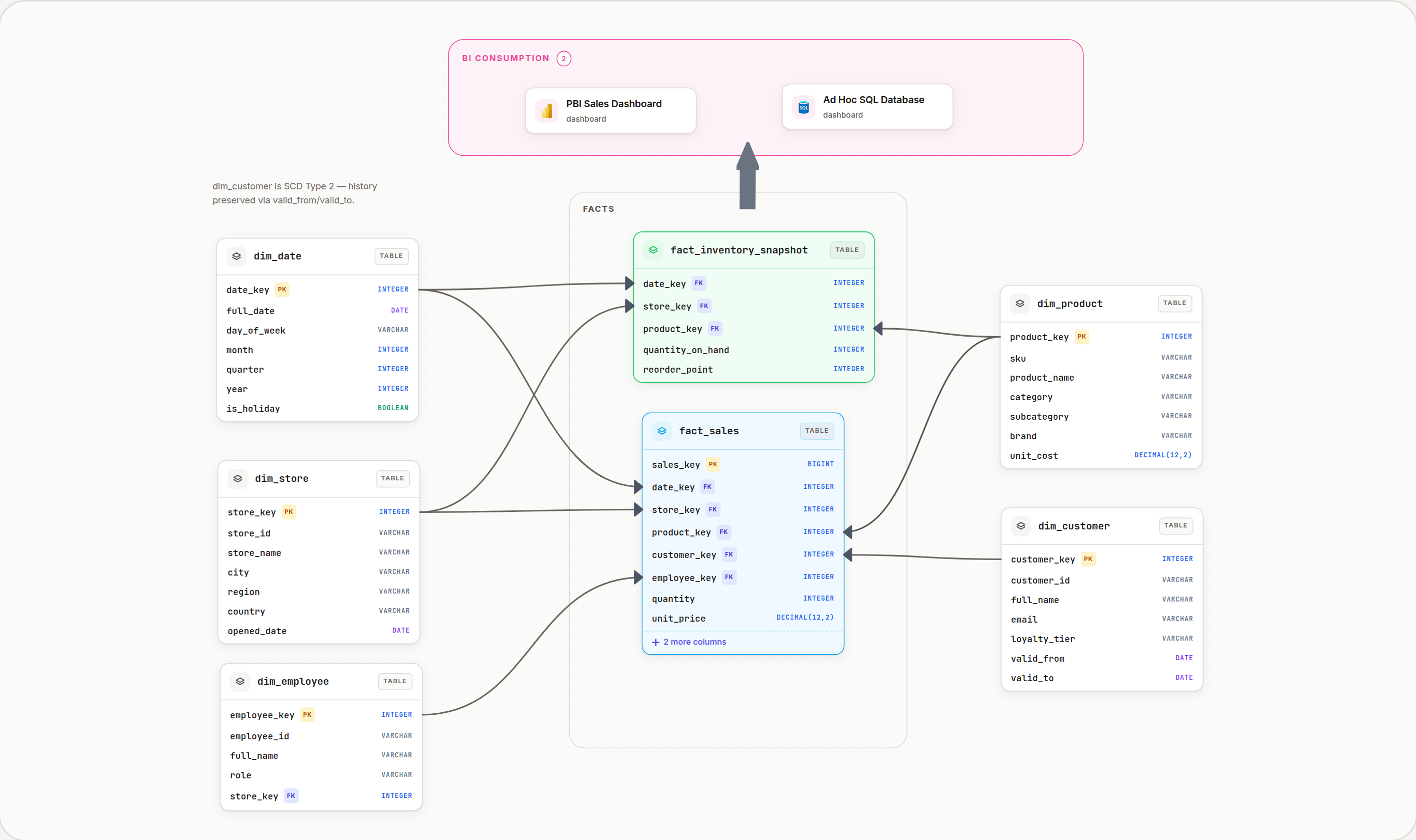
A real generated diagram: dimensions joined to facts key by key, with the BI layer that consumes them.
If it lives in git, let the code draw it
Connect the repository behind your pipelines and Datadef generates the diagram from the code, then re-syncs it daily as the code moves. Hand-drawn freshness stops being your job.
How repo to diagram worksHonest answers
Does Datadef connect to my warehouse and harvest lineage automatically?▼
No. Lineage on Datadef is drawn or generated on the canvas: describe the flow in a prompt, paste the SQL behind a model, or sync a repository and let the code define the diagram. Nothing crawls your warehouse or its query logs. The trade is deliberate: you get a curated map people can actually read, not ten thousand auto-harvested edges nobody can.
Is it really column level?▼
Yes, where you want it. Nodes carry their named, typed columns, and edges connect column to column, so a KPI points at the exact fields that build it, not just the table they sit in. Sections where that detail would be noise can stay table-to-table. Your call, per edge.
Can I try it without an account?▼
Yes. The scratch canvas at datadef.io/scratch is the full editor, free, no account. Paste the SQL behind a model and get it drawn. Work saves in your browser and you can claim it into an account later.
How does the lineage stay current?▼
A map you drew by hand is yours to keep current, and honestly it will only be as fresh as your last edit. Diagrams generated from a repository are different: a daily sync regenerates them when the code moves. If your models live in git, that is the path that stays true on its own.
What can I attach to a node?▼
An owner and a team, so questions about a table have a first responder. Links out to the things the node represents: the dbt repo, the dashboard, the runbook, the doc. Plus descriptions, tags, and status. The map stays one canvas, and the detail lives one click away.
New to the concept? What is data lineage, the guide
Comparing vendors first? The guide to data lineage tools puts Informatica, Collibra, Atlan, OpenLineage and dbt side by side. Just need the picture drawn? The data lineage diagram generator builds one from a written description of the flow.
Put your lineage on one canvas
Draw it, generate it from SQL, or sync the repo. Column-level lineage with owners on the nodes, readable by the people who ask the questions. The scratch canvas is free and needs no account.