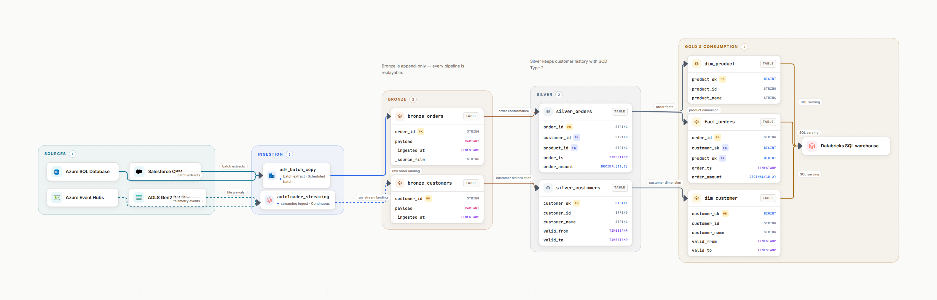
1. Why Diagram Your Databricks Platform?
Databricks is powerful, but it's also complex. Between Delta Lake layers, Unity Catalog namespaces, workflows, notebooks, and clusters, new team members spend weeks just understanding what exists. A good diagram compresses that learning curve from weeks to hours.
The Hidden Cost of Poor Documentation
When production breaks at 2 AM, your team shouldn't be hunting through notebooks to understand data flow. Without clear diagrams, incident response times can be 3-5x longer, and onboarding new engineers takes months instead of weeks.
Databricks diagrams solve three problems:
Faster Onboarding
New engineers understand the platform in days, not months. They see how data flows from ingestion to consumption without digging through code.
Faster Debugging
When pipelines break, diagrams show dependencies instantly. Find upstream issues in minutes instead of hours of code archaeology.
Better Collaboration
Align data engineers, analytics engineers, and stakeholders. A shared visual language prevents miscommunication.
From experience
On client platforms, the single artefact that shortens onboarding most is one architecture diagram people actually trust. The trust is the whole trick: it has to be updated when the platform changes, not six months later when a new joiner asks for it and someone opens the slide deck.
2. Core Components to Include
A comprehensive Databricks diagram shows the full data lifecycle. Here are the essential components every diagram should include.
Data Sources
Where data originates before entering Databricks.
- • External databases (PostgreSQL, MySQL, SQL Server)
- • Cloud storage (S3, Azure Blob, GCS)
- • Streaming sources (Kafka, Event Hubs, Kinesis)
- • APIs and SaaS applications
Delta Lake Layers
Medallion architecture: Bronze → Silver → Gold.
- • Bronze: Raw data, exactly as ingested
- • Silver: Cleaned, validated, deduplicated
- • Gold: Business-level aggregates
- • Show transformations between layers
Unity Catalog
Governance and organization structure.
- • Catalogs (environments: dev, staging, prod)
- • Schemas (logical groupings: sales, marketing)
- • Tables and views within schemas
- • Access controls and permissions
Workflows & Jobs
Orchestration and scheduling.
- • Databricks Workflows (job clusters)
- • Notebooks and tasks
- • Dependencies between jobs
- • Schedule triggers (hourly, daily, event-based)
Compute Resources
Clusters and serverless compute.
- • All-purpose clusters (interactive development)
- • Job clusters (production workloads)
- • SQL warehouses (BI queries)
- • Cluster policies and configurations
Downstream Consumers
Where data goes after processing.
- • BI tools (Tableau, Power BI, Looker)
- • Data apps and APIs
- • ML models and feature stores
- • Exports to other systems
Pro Tip
Start Simple, Add Detail
Don't try to diagram everything at once. Start with a high-level architecture showing major components. Then create focused diagrams for specific data flows (e.g., "Customer 360 Pipeline" or "Marketing Analytics ETL").
3. Diagramming Medallion Architecture
The medallion architecture (Bronze → Silver → Gold) is Databricks' core pattern. Your diagram should make this progression immediately obvious.
Bronze Layer: Raw Ingestion
Represents data exactly as it arrives. No transformations, no filtering, just append-only storage.
Visual representation:
- • Use bronze/copper color tones
- • Label tables with source system name
- • Show ingestion method (batch, streaming, CDC)
- • Include ingestion frequency (real-time, hourly, daily)
Silver Layer: Cleaned & Validated
Cleaned, deduplicated, and validated data. Business rules applied, data types standardized.
Visual representation:
- • Use silver/gray color tones
- • Show transformations from bronze (arrows with labels)
- • Note data quality checks applied
- • Indicate if slowly changing dimensions (SCD) are handled
Gold Layer: Business Aggregates
Analytics-ready data. Denormalized, aggregated, and optimized for business questions.
Visual representation:
- • Use gold/yellow color tones
- • Label with business domain (Sales, Marketing, Finance)
- • Show which BI tools or apps consume each table
- • Note refresh frequency and SLAs
Example: Medallion flow
Sources → Bronze Layer → Silver Layer → Gold Layer → Consumers
         (Raw)         (Cleaned)        (Aggregated)

kafka.orders  →  bronze.orders  →  silver.orders_clean  →  gold.daily_sales  →  Tableau
                  (append-only)     (deduped, validated)   (daily rollup)       Power BI

s3.customers  →  bronze.customers  →  silver.customers_scd  →  gold.customer_360  →  ML models
                  (raw JSON)           (Type 2 SCD)             (joined, enriched)    Data apps
4. Showing Unity Catalog Structure
Unity Catalog organizes data with a three-level namespace: Catalog → Schema → Table. Your diagram should show this hierarchy clearly, especially how environments are separated.
Catalog Level: Environments
Typically represents environments or business units.
dev_catalog, staging_catalog, prod_catalogor:
sales_catalog, marketing_catalog, finance_catalogSchema Level: Data Domains
Logical groupings within a catalog, often matching medallion layers or business domains.
bronze, silver, goldor:
sales, customers, productsTable Level: Individual Tables
Actual Delta tables and views that store data.
prod_catalog.gold.daily_salesprod_catalog.silver.customers_cleanprod_catalog.bronze.raw_orders| Element | How to Show It | Why It Matters |
|---|---|---|
| Catalog | Top-level container, label environment | Shows data isolation (dev vs. prod) |
| Schema | Group related tables visually | Shows logical organization |
| Access Controls | Annotation or icon showing who can access | Documents governance and security |
| Lineage | Arrows showing table dependencies | Critical for impact analysis |
Pro Tip
Use Nested Boxes for Hierarchy
Visually nest schemas inside catalogs using containers or colored backgrounds. This makes the hierarchy immediately obvious: prod_catalog contains bronze/silver/gold schemas, which contain tables.
5. Workflows and Jobs
Databricks Workflows orchestrate your pipelines. Show how jobs connect to each other and to the data they produce.
What to Include
- Job name: Clear, descriptive labels
- Schedule: Hourly, daily, event-triggered
- Dependencies: Which jobs must run first
- Tables read/written: Input and output
- Cluster type: Job or all-purpose cluster
Visual Conventions
- Use rectangles with rounded corners for jobs
- Arrows show execution order
- Color-code by domain or layer
- Include SLA times if critical
- Show parallel vs. sequential execution
Example: Job orchestration diagram
┌─────────────────────┐
│ Ingest Raw Orders   │ (Daily @ 6 AM)
│ kafka → bronze      │
└──────────┬──────────┘
           │
           ▼
┌─────────────────────┐
│ Clean Orders        │ (After ingestion)
│ bronze → silver     │
└──────────┬──────────┘
           │
           ├─────────────────────┐
           ▼                     ▼
┌──────────────────┐  ┌──────────────────┐
│ Daily Sales      │  │ Customer 360     │
│ silver → gold    │  │ silver → gold    │
└──────────────────┘  └──────────────────┘
           │                     │
           └──────────┬──────────┘
                      ▼
           ┌──────────────────┐
           │ Refresh BI Views │ (SLA: 8 AM)
           └──────────────────┘
Don't Forget Dependencies
The most valuable information in a workflow diagram is which jobs depend on which. When production breaks, this tells you which downstream jobs will fail and what order to fix things in.
6. Visual Conventions That Work
Consistency is key. Use these conventions to make your diagrams immediately readable.
Shape Conventions
Rectangle
Delta tables, databases
Rounded rectangle
Jobs, workflows, processes
Circle/Oval
External sources, consumers
Diamond
Decision points, conditional logic
Color Conventions
Bronze/Copper
Raw data, bronze layer
Silver/Gray
Cleaned data, silver layer
Gold/Yellow
Business aggregates, gold layer
Blue
Jobs, workflows, compute
Left-to-right flow
Data flows from left (sources) to right (consumers). This matches how we read and makes data movement intuitive.
Group related components
Use containers or colored backgrounds to group tables by schema, domain, or environment. Visual hierarchy matters.
Label everything
Every table, job, and arrow should have a label. Abbreviations are fine if you define them in a legend.
Show cardinality
Use arrow annotations to show 1:1, 1:N, or N:M relationships. Critical for understanding data multiplication.
Include refresh frequency
Annotate tables with how often they update: "Real-time", "Hourly", "Daily", "On-demand".
Keep legends visible
Always include a legend explaining shapes, colors, and symbols. Don't make readers guess.
From experience
The best diagrams follow the "5-second rule": a new person should understand the high-level flow in 5 seconds. If they need more than 30 seconds to figure out where data starts and ends, simplify.
7. Best Practices Checklist
Start with high-level architecture
Create a 10,000-foot view showing major components before diving into details. This is your onboarding diagram.
Create focused pipeline diagrams
Break complex platforms into specific data flows (e.g., "Customer Analytics Pipeline", "Real-time Events Pipeline").
Show the medallion progression clearly
Use distinct colors for Bronze → Silver → Gold. Make the data refinement journey obvious.
Document Unity Catalog structure
Show catalog/schema/table hierarchy. Use nested containers to represent the three-level namespace.
Include job dependencies
Show which workflows depend on others. This is critical for debugging and understanding impact.
Label everything with context
Don't just say "orders_table". Say "orders_table (daily refresh, 2M rows, feeds daily_sales)". Context is king.
Keep diagrams version-controlled
Store diagrams in Git alongside your code. Update them in PRs when you change the platform.
Review and update quarterly
Platforms evolve. Schedule quarterly reviews to keep diagrams accurate, or they become technical debt.
Pro Tip
The "New Hire Test"
Show your diagram to a new team member and ask: "If you needed to debug why customer_360 is missing data, where would you start?" If they can't trace the lineage in 30 seconds, your diagram needs more clarity.
8. Frequently Asked Questions
What should a Databricks architecture diagram include?
Include: data sources and ingestion patterns, Delta Lake tables with layers (bronze/silver/gold), Unity Catalog organization, Databricks workflows and jobs, compute clusters, notebooks, downstream consumers, and data governance elements like access controls and lineage.
How do you show the medallion architecture in a diagram?
Use three distinct visual layers: Bronze (raw data ingestion), Silver (cleaned and validated), and Gold (business-level aggregates). Show data flowing left-to-right through these layers. Use color coding: bronze/copper tones for raw, silver/gray for refined, gold/yellow for analytics-ready data.
What tools are best for creating Databricks diagrams?
Options include: Datadef (specialized for data platforms with Databricks components), Lucidchart (general diagramming), draw.io (free and open-source), Miro (collaborative whiteboarding), or Databricks notebooks with Mermaid.js for code-based diagrams. Choose based on whether you need collaboration, version control, or Databricks-specific icons.
How detailed should a Databricks platform diagram be?
Create multiple views: a high-level architecture showing major components for executives, a data flow diagram showing bronze/silver/gold layers for data engineers, and detailed pipeline diagrams showing specific transformations. Start simple and add detail based on audience needs.
Should I include compute details in my diagram?
Include high-level compute information: job clusters vs. all-purpose clusters, SQL warehouses for BI workloads. Don't include exact instance types unless it's critical for cost optimization discussions. Focus on what compute does (batch processing, interactive queries) rather than technical specs.
How do I keep diagrams up to date?
Store diagrams in your Git repository alongside code. Make diagram updates part of your pull request process, if you add a new pipeline, update the diagram in the same PR. Schedule quarterly reviews to catch any drift. Use tools that support version control and collaborative editing.
Generate Your Databricks Diagram in Minutes
Stop wrestling with generic diagramming tools. Create professional Databricks architecture diagrams with AI assistance and Databricks-specific components.
Related Guides
Medallion Architecture
Bronze, Silver, Gold layers for Databricks lakehouses
AWS Data Platform Diagram
Design AWS data platforms with S3, Redshift, and Glue
Azure Data Platform Diagram
Design Azure data platforms with Synapse and Data Factory
Data Mesh Guide
Decentralized data architecture patterns
Databricks Architecture Generator
Generate your lakehouse diagram (Unity Catalog, Delta, jobs) from one prompt