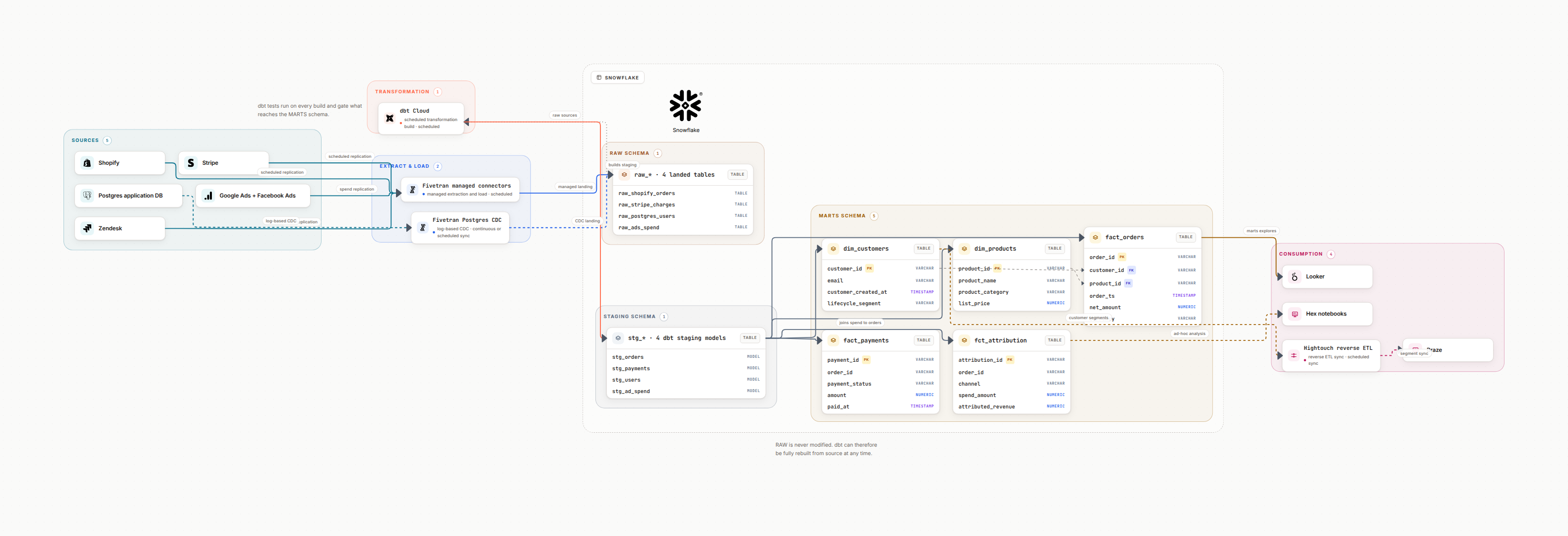
The short answer
The best tool for data architecture diagrams depends on the job. Draw.io is the strongest free general canvas. Lucidchart fits stakeholder presentations. Mermaid keeps small diagrams as text in Markdown. dbdiagram.io is the fastest pure ERD tool. Miro wins live workshops. Datadef is the pick when the diagram should generate itself and stay current: describe the pipeline in plain language, connect the GitHub, GitLab, or Azure DevOps repository (Terraform included), or let your AI agent draw over MCP, then embed the live image in Confluence, Notion, or a README so it never goes stale. The rest of this guide is the evidence: all 12 tools tested on the same pipeline.
1. Why Your Tool Choice Matters
I've seen teams spend weeks creating beautiful architecture diagrams in PowerPoint, only to have them become instantly outdated when the first change ships. The right tool makes diagrams easy to update, the wrong one makes them impossible to maintain.
The Documentation Graveyard
Most architecture diagrams die within 3 months because they're too hard to update. If updating a diagram takes more than 5 minutes, it won't get updated. Choose a tool that makes updates trivial, not a chore.
A good diagramming tool should:
Be Fast
Create and update diagrams in minutes, not hours. Drag-and-drop, templates, and auto-layout save time.
Enable Collaboration
Multiple people can edit, comment, and review. Integrates with your team's workflow.
Support Versioning
Track changes over time. See who changed what and when. Rollback when needed.
From experience
The best tool is the one your team will actually use. I've seen teams pick enterprise platforms with every feature imaginable, then watch everyone revert to screenshots in Slack because the tool was too slow. Speed and simplicity beat features.
2. Common Use Cases
Different scenarios need different tools. Here are the four most common use cases for data architecture diagrams:
Technical Documentation
Detailed data flow diagrams for engineering teams. Shows tables, schemas, transformations, and dependencies. If this is your case, start from a data pipeline diagram and add detail from there; for the cloud side of the same platform, the AWS architecture diagram generator starts from the VPC and the services instead of the tables.
Best tools: Datadef (AI-powered), Draw.io (flexible), dbt docs (integrated with dbt)
Executive Presentations
High-level architecture for stakeholders. Clean, simple, visually polished.
Best tools: Lucidchart (professional polish), Miro (presentation mode), PowerPoint (if unavoidable)
Collaborative Design Sessions
Whiteboarding new architectures with your team. Real-time collaboration, sticky notes, voting.
Best tools: Miro (infinite canvas), FigJam (Figma ecosystem), Excalidraw (quick sketches)
Living Documentation
Diagrams that update automatically from code or metadata. Always accurate, never stale.
Best tools: dbt docs (auto-generated lineage), Atlan (metadata-driven), Datadef (AI-updated)
Pro Tip
Match Tool to Audience
Use Miro for design sessions, export to Lucidchart for stakeholder presentations, and maintain technical detail in Datadef or Draw.io. Don't try to make one tool do everything, use the right tool for each context.
3. Three Categories of Tools
Diagramming tools fall into three categories. Understanding these helps you narrow down your options quickly.
Category 1: General Diagramming Tools
Swiss Army knives. You can draw anything, but you have to draw everything manually.
Examples: Lucidchart, Draw.io, Visio, Miro, FigJam
✅ Strengths
- • Flexible: draw anything
- • Large icon libraries
- • Good collaboration features
- • Familiar to most teams
❌ Weaknesses
- • Manual updates (time-consuming)
- • No metadata storage
- • Can't auto-sync with code
- • Becomes stale quickly
Category 2: Code-Based Diagramming
Define diagrams in code. Version control friendly, but steep learning curve.
Examples: Mermaid, PlantUML, Diagrams (Python), Structurizr
✅ Strengths
- • Lives in Git with your code
- • Version controlled by default
- • Can be generated programmatically
- • Great for technical docs
❌ Weaknesses
- • Learning curve (syntax)
- • Limited layout control
- • Not stakeholder-friendly
- • Hard to collaborate with non-devs
Category 3: Data-Specific Tools
Built specifically for data architecture. Understand schemas, lineage, and data concepts natively.
Examples: Datadef, dbt docs, Atlan, Eraser (data mode)
✅ Strengths
- • Native data concepts (tables, pipelines)
- • Auto-layout for complex flows
- • Metadata and lineage tracking
- • Some offer AI generation
❌ Weaknesses
- • Less flexible for non-data diagrams
- • Smaller ecosystems
- • May require new workflows
- • Some are newer/less proven
Quick decision
Need quick, flexible diagrams? → General tools (Lucidchart, Draw.io)
Want diagrams in Git? → Code-based (Mermaid, PlantUML)
Complex data pipelines with metadata? → Data-specific (Datadef, dbt docs)
4. Detailed Tool Comparison
Here's an honest comparison of the tools we reach for most. I've used all of these in production environments.
Datadef
AI-powered data architecture diagramming
Generate data architecture diagrams instead of drawing them: from a plain-language description, from a connected GitHub, GitLab, or Azure DevOps repository (Terraform repos are parsed file by file), or from your AI agent over MCP. Diagrams embed as live images in Confluence, Notion, and READMEs, and repo-linked diagrams re-sync daily.
Best for:
- • Diagrams that must stay current (repo sync + live embeds)
- • Complex data pipeline documentation
- • AI agent workflows (Claude Code, Cursor via MCP)
Limitations:
- • Focused on data and infrastructure architectures
- • Newer tool (smaller community)
Draw.io (diagrams.net)
Free, open-source diagramming
The gold standard for free diagramming. Desktop app or web-based. Integrates with Google Drive, GitHub, Confluence.
Best for:
- • Teams on a budget
- • Git-based workflows (XML format)
- • Offline/on-premise requirements
Limitations:
- • Basic collaboration (no real-time)
- • UI feels dated
- • Manual everything
Lucidchart
Professional diagramming platform
The enterprise standard. Polished UI, real-time collaboration, extensive integrations. If you need to impress stakeholders, this is it.
Best for:
- • Executive presentations
- • Enterprise teams
- • Cross-functional collaboration
Limitations:
- • Per-user subscription, and team features sit on the higher tiers
- • Overkill for technical docs
- • Proprietary format
Miro
Infinite canvas collaboration
Best for brainstorming and design sessions. Infinite canvas, sticky notes, voting, presentations. Real-time collaboration is exceptional.
Best for:
- • Collaborative design sessions
- • Workshops and brainstorming
- • Remote teams
Limitations:
- • Can get messy at scale
- • Not great for technical precision
- • Free tier is limited
Mermaid
Text-based diagrams in Markdown
Write diagrams as code, render in Markdown. Works in GitHub, GitLab, Notion, Obsidian. Perfect for technical teams who live in Git.
Best for:
- • Documentation in Git
- • Technical teams
- • Simple flow diagrams
Limitations:
- • Limited layout control
- • Syntax learning curve
- • Not for complex diagrams
dbt docs
Auto-generated data lineage
If you use dbt, this generates lineage automatically from your models. Always accurate because it's derived from code. The ultimate living documentation.
Best for:
- • dbt users (obviously)
- • Transformation lineage
- • Living documentation
Limitations:
- • Only shows dbt models
- • Can't add upstream/downstream context
- • Limited customization
| Tool | Collaboration | Learning Curve | Price | Best Use Case |
|---|---|---|---|---|
| Datadef | Real-time | Easy (AI-powered) | Free + paid | Living diagrams from prompts and repos |
| Draw.io | Basic | Medium | Free | General diagrams |
| Lucidchart | Real-time | Easy | Per user | Presentations |
| Miro | Excellent | Easy | Free plan, then per member | Brainstorming |
| Mermaid | Git-based | Medium-Hard | Free | Technical docs |
| dbt docs | Read-only | Easy | Free | dbt lineage |
5. Decision Framework
Stop overthinking. Answer these four questions and you'll know which tool to use.
If the shortlist has already narrowed to two, the head-to-head pages go feature by feature rather than category by category: Datadef against Lucidchart, against draw.io, and against Mermaid for teams who want the diagram to live in the repository as text.
Question 1: Who is the audience?
Engineers/technical team: Draw.io, Mermaid, Datadef, dbt docs
Executives/stakeholders: Lucidchart, Miro (presentation mode)
Cross-functional teams: Miro, FigJam, Lucidchart
Question 2: How complex is the diagram?
Simple (5-10 boxes): Mermaid, Excalidraw, any tool works
Medium (10-30 boxes): Draw.io, Lucidchart, Datadef
Complex (30+ boxes): Datadef (AI layout), dbt docs (auto-generated)
Question 3: How often will it change?
One-time diagram: PowerPoint, Excalidraw, whatever's fastest
Monthly updates: Draw.io, Lucidchart, Miro
Changes with every deploy: dbt docs, Mermaid in Git, Datadef
Question 4: What's your budget?
Nothing to spend: Draw.io, Mermaid, dbt docs, and Datadef apart from its AI generation
A per-seat subscription: Lucidchart, Miro
Enterprise: Lucidchart Enterprise, Atlan, Collibra
Decision Matrix
The 5-Second Test
Can someone who didn't create the diagram update it in under 5 minutes? If not, you picked the wrong tool. Maintainability beats features every time.
Formula: (Update frequency) × (Team size) × (Diagram complexity) = How much pain you'll feel if you pick wrong
6. Best Practices for Architecture Diagrams
The tool matters less than how you use it. Follow these principles regardless of which tool you choose.
Two of the practices below stop being manual work once the diagram is generated instead of drawn. If your infrastructure is declared in code, a diagram built from your Terraform files is versioned by definition, because it is redrawn from the same commit the reviewer is reading. And "link to runbooks and code" works in the other direction too: a live embed puts the current diagram inside the README or the Confluence page rather than a screenshot that was accurate in March. For pipeline-shaped diagrams specifically, the data flow diagram generator guide covers the notation choices that make direction and batch versus streaming readable.
Use consistent visual language
Pick a color scheme and stick to it. Blue for databases, orange for processing, green for outputs. Consistency makes diagrams scannable.
Add metadata to every box
Include: what it does, owner/team, SLA, tech stack. Future you (or your replacement) will thank you.
Show data flow direction clearly
Arrows should always point in the direction data flows. Use arrow styles to indicate batch vs. streaming.
Layer your diagrams
Create multiple views: high-level for execs, detailed for engineers. Don't try to show everything in one diagram.
Version control your diagrams
Save diagrams in Git (as files or links). Tag major versions. Future debugging will need to reference old architectures.
Link to runbooks and code
Every diagram should link to: runbooks, repos, monitoring dashboards, Slack channels. Make it a living index.
Update diagrams in every PR
Make diagram updates part of your definition of done. If the code changed, the diagram changes too.
Test diagram accuracy monthly
Schedule a monthly review. Walk through each box and ask: "Is this still true?" Kill outdated diagrams ruthlessly.
Example: Good vs. Bad Data Flow Diagram
❌ Bad
- • Just box names: "Database", "API", "S3"
- • No metadata or context
- • Unclear data flow direction
- • No owner information
- • Last updated: 2022
✅ Good
- • Specific: "PostgreSQL (orders_db)"
- • Metadata: "Owner: @data-platform"
- • Clear arrows showing flow direction
- • Links to runbooks and dashboards
- • Updated automatically or weekly
From experience
I've debugged production incidents where the only documentation was a 2-year-old diagram with question marks on half the boxes. Don't let that be you. Outdated documentation is worse than no documentation: it actively misleads people.
7. Our Recommendations by Scenario
Here's what I'd choose in different situations, based on building data platforms at multiple companies.
Scenario 1: Startup data team (2-5 people)
You're moving fast, budget is tight, and you need something that works yesterday.
Recommended stack:
- • Primary: Datadef for data pipelines, AI speeds up the first draft
- • Backup: Draw.io for misc diagrams, free and works offline
- • Collaboration: Miro free tier for design sessions
Runs on free plans and trials, so the only cost is your time
Scenario 2: Mid-size company (10-30 data engineers)
You have budget, multiple teams, and need collaboration features. Standards matter.
Recommended stack:
- • Technical docs: Datadef or Draw.io (team standard)
- • Stakeholder presentations: Lucidchart (professional polish)
- • Workshops: Miro (real-time collaboration)
- • dbt lineage: dbt docs (if using dbt)
Two per-seat subscriptions, so budget per engineer rather than per team
Scenario 3: Enterprise (100+ engineers)
You need governance, security, audit trails, and enterprise support. Cost is secondary.
Recommended stack:
- • Primary: Lucidchart Enterprise (SSO, governance)
- • Data catalog: Atlan or Collibra (auto-generated lineage)
- • Technical docs: Confluence + Draw.io plugin
- • Git-based: Mermaid in Markdown for dev docs
Total cost: Enterprise pricing (negotiate)
Scenario 4: Solo data engineer documenting everything
You're the only data person. You need to document fast and make it maintainable.
Recommended stack:
- • Primary: Datadef (AI generates diagrams from descriptions, fastest option)
- • Backup: Mermaid in GitHub README (lives with code)
- • If using dbt: dbt docs (auto-generates lineage)
Free plans and trials cover a solo setup
Universal Truth
Use Multiple Tools
The best teams don't pick one tool: they use the right tool for each context. Mermaid for technical docs in Git, Lucidchart for exec presentations, Datadef for complex pipeline documentation. Don't force one tool to do everything.
8. Frequently Asked Questions
What is the best tool for data architecture diagrams?
It depends on the job. Draw.io is the strongest free general canvas. Lucidchart fits stakeholder presentations. Mermaid keeps small diagrams as text in Markdown. dbdiagram.io is the fastest pure ERD tool. Miro wins live workshops. Datadef is the pick when the diagram should generate itself and stay current: it draws from a plain-language description, from a connected GitHub, GitLab, or Azure DevOps repository including Terraform, or from an AI agent over MCP, and embeds as a live image in Confluence, Notion, or a README.
What is the best free tool for data architecture diagrams?
Draw.io (diagrams.net) is the best free option with no limits on diagrams, full icon libraries, and version control integration. For AI-powered diagramming, Datadef draws 1 diagram a day free with no account: you describe the pipeline in natural language and get an editable diagram. Pro, with unlimited AI, repository sync and live embeds, is $12 a month after a 7-day trial.
Should I use a general diagramming tool or a specialized data architecture tool?
General tools (Lucidchart, Draw.io) work for most needs and integrate well with existing workflows. Specialized tools (Datadef, Eraser) are better for complex data pipelines that need metadata, lineage tracking, and automatic layout.
What tool do enterprise data teams typically use?
Enterprise teams often use a combination: Lucidchart or Confluence for stakeholder-facing diagrams, Draw.io or Miro for collaborative design sessions, and specialized tools like Datadef for technical data pipeline documentation.
Can I export diagrams to use in documentation?
Most tools support PNG/SVG export. For living documentation, look for tools that embed in Confluence, Notion, or GitHub. Draw.io has native Confluence integration, while Datadef embeds a live diagram image that updates when the canvas or the connected repository changes.
How do I keep diagrams up to date?
Make diagram updates part of your PR checklist and use tools that integrate with your workflow: Mermaid in GitHub, Draw.io in Confluence. The stronger approach is generation from code: dbt docs for dbt lineage, or Datadef repository sync, which re-reads the connected repo daily (Terraform repos are parsed file by file) and regenerates both the diagram and its doc.
Is PowerPoint acceptable for architecture diagrams?
PowerPoint is fine for one-off presentations, but terrible for living documentation. It's not collaborative, doesn't version control well, and becomes stale immediately. Use it only when you need to match corporate presentation templates.
Start Creating Better Architecture Diagrams
Generate professional data architecture diagrams from natural language. Describe your pipeline and get an interactive diagram in seconds.
Related Guides
AWS Data Platform Diagram
Design AWS data platforms with S3, Redshift, and Glue
Azure Data Platform Diagram
Design Azure data platforms with Synapse and Data Factory
Data Pipeline Documentation
How to document pipelines that stay up to date
Keeping Data Documentation in Sync
Automation strategies for up-to-date documentation