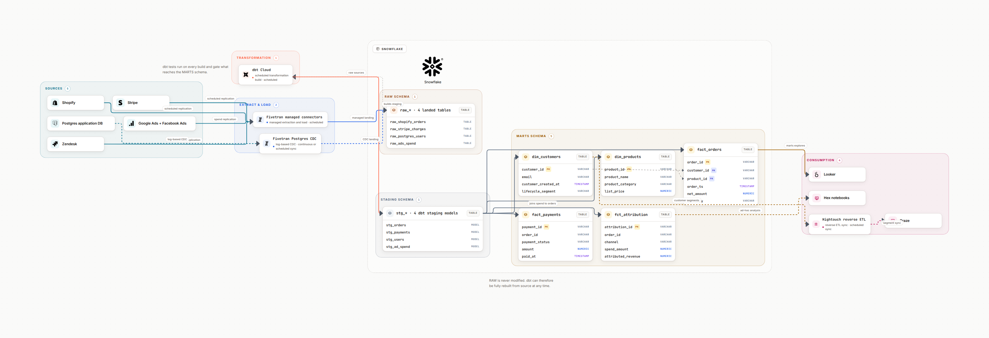
Why use a data diagram generator
Most data teams redraw the same shapes every quarter. An AI-first generator drafts the layout, keeps styling consistent, and lets you focus on correctness instead of arrows.
The win is speed, but the real gain is trust. Fresh diagrams unblock onboarding, postmortems, and audits because they match what is actually running.
Faster first draft
Generate a full pipeline view from a paragraph of context and a list of systems instead of starting from a blank canvas.
Consistent styling
Standard colors for sources, transforms, and serving layers so teams can read diagrams without a legend.
Operator-friendly
Include owners, run cadence, and SLAs on nodes so on-call engineers know who to page.
Export anywhere
Keep editable JSON plus PNG/SVG exports for decks, wikis, and incident docs.
What great data diagram generators do
A good generator understands data primitives and keeps your diagram aligned to the underlying assets. Look for these capabilities before you standardize on a tool.
Data-aware shapes
Pipelines, tables, streams, dashboards, and policies are first-class, not generic boxes.
Auto-layout with lanes
Group by source, transform, and serving zones. Keep arrows readable even as the graph grows.
Text-to-diagram prompts
Generate from natural language and refine with short edits instead of pixel pushes.
Versioning and embeds
Store history, diff versions, and embed live diagrams in Confluence or Notion.
How to structure a high-signal diagram
Start with three zones: ingest, transform, serve. Then add metadata that reduces follow-up questions. Avoid tiny fonts; prioritize what operators need during an incident.
- Show sources with protocol (CDC, batch, API, files) and freshness expectations.
- Label transformations with job names and schedules (dbt models, Airflow DAG IDs, Glue jobs).
- Show storage layers with tiers: raw, refined, curated. Call out retention and encryption.
- Draw consumer paths: BI, ML features, reverse ETL, alerts. Note the owning team.
- Include governance overlays: PII, SOC2 boundaries, and audit logging points.
Workflow to stay accurate
Treat diagrams like code. Regenerate from prompts tied to your latest schema, review changes, and publish alongside runbooks.
Repeatable loop
- • Draft from a prompt using current systems and datasets.
- • Validate owners, SLAs, and dependencies with the team.
- • Export SVG + PNG; keep JSON in git for diffing.
- • Publish to wiki with a date stamp and a link to source.
Copy-paste prompts for better diagrams
Publish checklist (use every time)
FAQ
What makes a good data diagram generator?
It should handle data-specific shapes (sources, pipelines, warehouses), auto-layout complex graphs, export to PNG/SVG, and keep metadata like owners and SLAs attached to nodes.
How do I keep generated diagrams accurate over time?
Use prompts that include table names, job IDs, and SLAs; link diagrams to source control; and regenerate from the latest schema instead of editing stale screenshots.
Can AI-generated diagrams replace manual whiteboarding?
Use AI to draft the first version from text, then refine with your team. Keep a stable template for production diagrams and a sandbox for workshops.
What formats should I export?
Keep an editable source (JSON), a vector version (SVG), and a compressed PNG for decks. Store exports alongside runbooks so on-call engineers can find them quickly.
Generate your next diagram in minutes
Turn a paragraph into a production-ready data diagram with consistent styling, exports, and version history.
Generate a diagram, free